
When thinking about content quality, it’s incredibly important to meet or exceed user expectations based on query. If your content cannot do that, then users can end up extremely frustrated as they search Google, click through your listing in the search results, scan your page, and not find what they were looking for. And that can lead to all sorts of problems SEO-wise.
When you don’t meet or exceed user expectations, one possible result is a user jumping back to the search results to find another solution (low dwell time). That’s clearly not what you want, but beyond the jump back to the SERPs, there are also times users stay on the site and keep digging believing they can ultimately find what they were looking for. That’s a classic engagement trap where users can end up running around a site visiting page after page without finding what they were looking for.
From a broad core algorithm update standpoint, Google is not going to react well over time when sites frustrate users and cannot provide answers that meet or exceed user expectations. We’ve seen that time and time again when broad core ranking updates roll out. In addition, I’ve seen this for a very long time with major algorithm updates overall, including during medieval Panda days.
As I’ve said many times before while writing about major algorithm updates, “Hell hath no fury like a user scorned”. In other words, don’t frustrate your users or bad things can happen during major Google algorithm updates.
This sounds logical, but how you can show a site owner user frustration like I explained above? For example, real data showing that users are frustrated versus just providing your opinion. Well, I surfaced a great example recently and I’m going to share more about that below. It’s something you can do for your own site and you can accomplish this using a tool that’s freely available and right under your nose – Google Analytics.
Backing Up SEO Intuition With Data – Visualizing User Frustration
I’m helping a site now that has been negatively impacted by two broad core updates in a row. I started helping them in April after they reached out to me about being hit by the January 2020 Core Update. Then as I was auditing the site, and they were making changes, the site was hit a second time during the May 2020 Core Update.
Remember, recent changes will typically not be taken into account with broad core updates and the site was just in the beginning stages of implementing changes. You can read my latest post about the May 2020 Core Update to learn more about that point (and other important points that site owners should know about Google’s broad core updates).
During the audit, I surfaced a number of key problems and the site owner has been moving as quickly as possible to implement those changes. One of the issues I surfaced involved user frustration and not meeting expectations based on query.
The site had a number of pages that were ranking well for queries where users had a very specific intent (and I would go as far as saying it was an extremely strong intent). Unfortunately, the pages could not help users achieve that goal. They tangentially covered the topic, but couldn’t provide exactly what users were looking for.
And beyond that, the pages contained information and links that might lead some users to believe they could still find a solution deeper on the site. This could lead to the engagement trap situation I mentioned earlier where users end up digging and digging with no possible way to find gold.
To show the impact during a broad core update, here are two pages like this on the site and their respective drops during the January 2020 core update:
As I was auditing the site, I began to experience user frustration like I mentioned earlier… I was running in circles when I put myself in the shoes of a typical user. It was extremely frustrating… and although I could see many clicks leading to these pages, GSC alone couldn’t provide the full story. So I switched to Google Analytics and a feature that I believe is completely underutilized – Behavior Flow.
Behavior flow enables you to visualize the journey users take through your site based on a dimension you select as a starting point. For example, you can view the path through your site based on traffic source, medium, campaign, landing page, and more. I bolded landing page since that’s exactly what I’m going to show you below for the page type I covered earlier.
Here is what Behavior Flow reporting looks like in GA:
A quick note about sampling:
It’s important to know that Flow Visualization reports in Google Analytics are sampled. Behavior Flow is based on 100K sessions based on the selected timeframe. To get around sampling, you can always shorten the time range to get the number of sessions under the sampling threshold. Just keep this in mind while reviewing the reporting.
When “Engagement” Could Mean Frustration: How To Use Behavior Flow To Visualize Frustrated Users
During the engagement, I ran a traffic drop report (previously called Panda report) to surface the largest drops by landing page after the January and May core updates. Again, the site had a number of key problems across various page types that were problematic. One was the page type I explained earlier, which not only couldn’t meet or exceed user expectations, but it also had the potential to lead users to more pages thinking they could find a solution.
I checked Google Analytics for landing page metrics and noticed one of the problematic urls had a 65% standard bounce rate. That means 35% of users visited another page on the site (which accounts for nearly 20K users during the timeframe). I wanted to see where those users were visiting after the landing page. In other words, were they happy with their visit or were they banging their head against their monitor while endlessly roaming around the site in search for a solution?
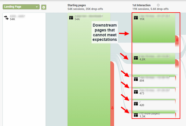
So I jumped to Behavior Flow in Google Analytics and set my starting point as that landing page. And once I did, I immediately noticed a problem. And that’s pretty much what I thought I would see!
For this page, 65% dropped off after visiting the landing page during the timeframe I selected (pre-core update). That’s not surprising, but the 35% remaining on the site displayed a path of frustration that was hard to ignore.
The next step for almost all of the users, which is labeled the “first interaction” after the landing page, was to pages that seemed like they could provide a solution, but really couldn’t. So, the landing page couldn’t meet user expectations and then 35% of the users landing on that page ended up visiting another page that couldn’t meet expectations either. Not good, but we’re just getting started.
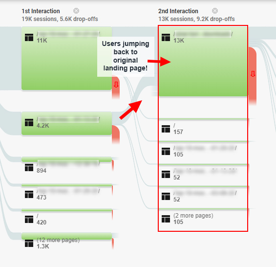
And then the second interaction was eye-opening. 68% of the users that clicked to a second page went back to the original page they visited from the search results! Yep, I was beginning to see user frustration in the visuals. They visited the landing page from the SERPs, couldn’t find what they were looking for, visited another page thinking they could find a solution, but couldn’t. So they went right back to the original landing page still looking for a solution!
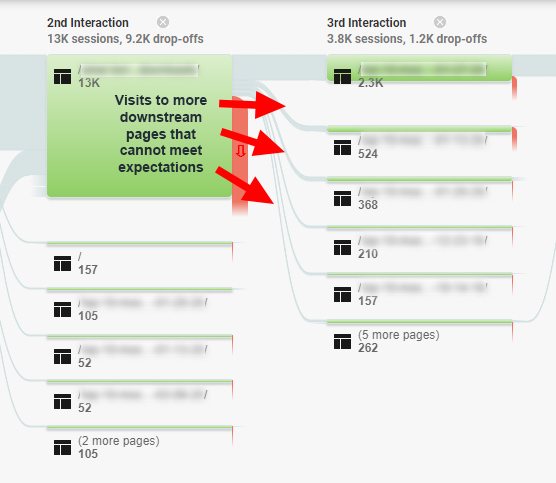
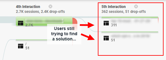
But the fun doesn’t stop there. The third interaction reveals users visiting even more pages from that original landing page believing they could find a solution. 20% of the users visiting the original landing page were now three interactions into their visit, with no hope of finding a solution.
But we’re not done yet. I keep using the word “trap” in this post and the fourth interaction underscores why. To quickly recap, we have users landing on a page (mostly from the SERPs), visiting another page to find a solution, then jumping back to the original landing page, and then desperately visiting more pages to find a solution.
What do you think happened next??
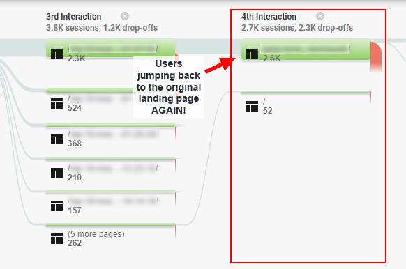
Yep, they went back to the original landing page again! 14% of users were now four interactions into the site (but back at the original landing page). Ugh.
And if they haven’t had enough, some users were still jumping to other pages from the original landing page to find a solution. Oh, those poor people… :)
As you can imagine, this led to a horribly frustrating experience for those users. And over time, hundreds of thousands of users were going through this process. I’m not saying this is the sole reason the site got pummeled by two core updates (remember, there are “millions of baby algorithms” at play with core updates), but it sure doesn’t help matters.
Using behavior flow in Google Analytics enabled me to visualize the frustration that users were experiencing while entering specific landing pages (and most visitors were from Google organic). And that visualization can go a long way when explaining to site owners how certain things need to change on a site. I know this example did.
I’ll end this post with some final tips and recommendations based on going through the process of visualizing user frustration using Behavior Flow in Google Analytics. Again, the great thing is you can go through this process today, and it’s free.
Using Behavior Flow To Visualize Frustration: Tips and Recommendations
- Identify high volume pages and dig into the data. Make sure you understand what’s going on user engagement-wise. Don’t assume all visits end with happy users.
- You can also run a traffic drop report to identify the biggest drops to landing pages across the site based on a core update, and then dig into those pages.
- Don’t just check a metric like standard bounce rate and make decisions. Dig deeper with other user engagement metrics and with additional functionality like Behavior Flow in Google Analytics.
- Use specific landing pages as the starting point in Behavior Flow and visualize the journey through your site. This is how you can identify engagement traps like I covered in this post.
- If you identify engagement traps, take action before Google takes action. Always try to meet or exceed user expectations based on query. Don’t wait until you drop based on a broad core update to fix user engagement problems, content quality, and more. Identify key problems with those pages and fix them as quickly as you can.
- Track Behavior Flow over time for the pages you identify as engagement traps. You should see improvements in the data and through the visualizations in the reporting after you fix those problems.
Summary – “Hell hath no fury like a user scorned”
This case study demonstrated how you can back up SEO intuition by using Behavior Flow in Google Analytics. By using this underutilized feature in GA, you can view the journey users take through your site. And you can use a number of dimensions as the starting point, including landing page.
Behavior Flow can absolutely help you identify problematic situations and then effectively communicate that story to site owners (backed by data). And that can help drive change. Like I said earlier, the amazing part is that it’s freely available in Google Analytics. You can literally start checking this now. So fire up Google Analytics, find those engagement traps, and fix them soon. Take action before Google takes action.
GG