Note, this tutorial works in conjunction with my Search Engine Watch column, which explains how to analyze the top landing pages from Google Organic prior to, and then after, Panda arrives. With the amount of confusion circling Panda, I wanted to cover a report webmasters can run today that can help guide them down the right path while on their hunt for low-quality content.
My Search Engine Watch column covers an overview of the situation, why you would want to run the top landing pages report (with comparison), and how to analyze the data. And my tutorial below covers how to actually create the report. The posts together comprise a two-headed monster that can help those hit by Panda get on the right track. In addition, my Search Engine Watch column covers a bonus report from Google Webmaster Tools that can help business owners gather more information about content that was impacted by the mighty Panda.
Why This Report is Important for Panda Victims
The report I’m going to help you create today is important, since it contains the pages that Google was ranking well and driving traffic to prior to a Panda attack. And that’s where Google was receiving a lot of intelligence about content quality and user engagement. By analyzing these pages, you can often find glaring Panda-related problems. For example, thin content, duplicate content, technical problems causing content issues, low-quality affiliate content, hacked content, etc. It’s a great way to get on the right path, and quickly.
There are several ways to run the report in Google Analytics, and I’ll explain one of those methods below. And remember, this should not be the only report you run… A rounded analysis can help you identify a range of problems from a content quality standpoint. In other words, pages not receiving a lot of traffic could also be causing Panda-related problems. But for now, let’s analyze the top landing pages from Google Organic prior to a Panda hit (which were sending Google the most data before Panda arrived).
And remember to visit my Search Engine Watch column after running this report to learn more about why this data is important, how to use it, red flags you can identify, and next steps for websites that were impacted. Let’s get started.
How To Run a Top Landing Pages Report in Google Analytics (with date comparison):
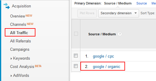
- First, log into Google Analytics and click the “All Traffic” tab under “Acquisition”. Then click “Google / Organic” to isolate that traffic source.

- Next, set your timeframe to the date after Panda arrived and extend that for a decent amount of time (at least a few weeks if you have the data). If time allows, I like to set the report to 4-6 weeks after Panda hit. If this is right after an algorithm update, then use whatever data you have (but make sure it’s at least one week). I’m using a date range after the Phantom update hit (which was May 8th).

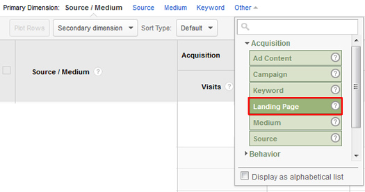
- Your next move is to change the primary dimension to “Landing Page” to view all landing pages from Google organic search traffic. Click the “Other” link next to “Primary Dimension” and select “Acquisition”, and then “Landing Page”. Now you will see all landing pages from Google organic during that time period.

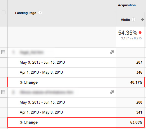
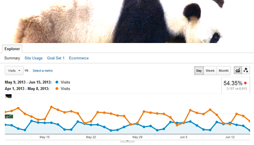
- Now let’s use some built-in magic from Google Analytics. In the timeframe calendar, you can click a checkbox for “Compare to” and leave “Previous period” selected. Once you click “Apply”, you are going to see all of the metrics for each landing page, but with a comparison of the two timeframes. And you’ll even have a nice trending graph up top to visualize the Panda horror.

- As you start going down the list of urls, pay particular attention to the “% Change” column. Warning, profanity may ensue. When you start seeing pages that lost 30%, 40%, 50% or more traffic when comparing timeframes, then it would be wise to check out those urls in greater detail. Again, if Google was sending a lot of traffic to those urls, then it had plenty of user engagement data from those visits. You might just find that those urls are seriously problematic from a content quality standpoint.

Bonus 1: Export to Excel for Deeper Analysis
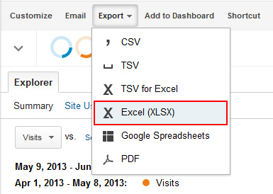
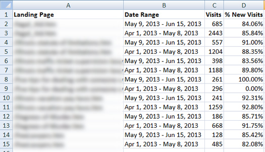
- It’s ok to stay within Google Analytics to analyze the data, but you would be better off exporting this data to Excel for deeper analysis. If you scroll to the top of the Google Analytics interface, you will see the “Export” button. Click that button and then choose “Excel (XLSX)”. Once the export is complete, it should open in Excel. Navigate to the “Dataset” worksheet to see your landing page data (which is typically the second worksheet).

- At this point, you should clean up your spreadsheet by deleting columns that aren’t critical for this report. Also, you definitely want to space out each column so you can see the data clearly (and the data headers).

- You’ll notice that each url has two rows, one for the current timeframe, and one for the previous timeframe. This enables you to see all of the data for each url during both timeframes (the comparison).

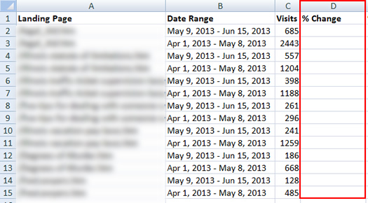
- That’s nice, but wouldn’t it be great to create a new column that showed the percentage decrease or increase for visits (like we saw in Google Analytics?) Maybe even with highlighting to show steep decreases in traffic Let’s do it. Create a new column to the right of “Visits” and before “% New Visits”. I would title this column “% Change” or something similar.

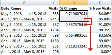
- Next, let’s create a formula that provides the percentage change based on the two rows of data for each url. Find the “Visits” column and the first landing page url (which will have two rows). Remember, there’s one row for each timeframe. If your visits data is in column C, then the post-Panda data is in row 2, and the pre-Panda data is in row 3 (see screenshot below). You can enter the following formula in the first cell for the new column “% Change”.=(C3-C2)/C3.Again, C3 is the traffic levels from the previous timeframe, C2 is the traffic levels from the current timeframe (after the Panda hit), and you are dividing by the previous traffic levels to come up with the percentage change. For example, if a url dropped from 5,450 visits to 640 visits, then your percentage drop would be 88%. And yes, you would definitely want to investigate that url further!

- Don’t worry about the floating decimal point. We’ll tackle that soon. Now we need to copy that formula to the rest of the column (but by twos). Remember, we have two records for each url, so you’ll need to highlight both cells before double clicking the bottom right corner of the second cell to copy the formula to all rows. Once you do, Excel automatically copies the two rows to the rest of the cells in that column. Now you should have percentage drops (or increases) for all the urls you exported. Note, you can also highlight the two cells, copy them, and then highlight the rest of that column, and click paste. That will copy the formula to the right cells in the column as well.

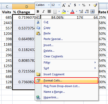
- Now, you will see a long, floating decimal point in our new column labeled “% Change”. That’s an easy fix, since we want to see the actual percentage instead. Highlight the column, right click the column, and choose “Format Cells”. Then choose “Percentage” and click “OK”. That’s it. You now have a column containing all top landing pages from Google organic, with the percentage drop after the Panda hit.

Bonus 2: Highlight Cells With A Steep Drop in Red
- If you want the data to “pop” a little more, then you can use conditional formatting to highlight cells that exceed a certain percentage drop in traffic. That can easily help you and your team quickly identify problematic landing pages.
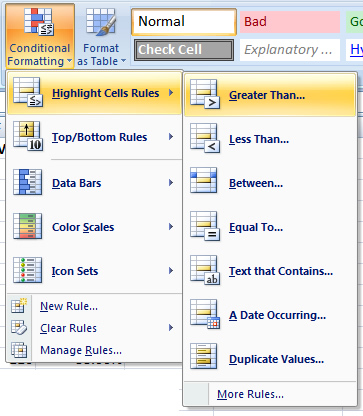
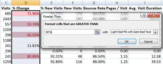
- To do that, highlight the new column we created (titled “% Change”), and click the “Conditional Formatting” button in your Home tab in Excel (located in the “Styles” group). Then select, “Highlight Cells Rules”, and then select, “Greater Than”. When the dialog box comes up, enter a minimum percentage that you want highlighted. And don’t forget to add the % symbol! Choose the color you want to highlight your data with and click “OK”. Voila, your problematic urls are highlighted for you. Nice.


Summary – Analyzing Panda Data
If you made it through this tutorial, then you should have a killer spreadsheet containing a boatload of important data. Again, this report will contain the percentage increase or decrease for top landing pages from Google Organic (prior to, and then after, a Panda hit). This is where Google gathered the most intelligence based on user engagement. It’s a great place to start your analysis.
Now it’s time to head over to my Search Engine Watch column to take a deeper look at the report, what you should look for, and how to get on the right track with Panda recovery. Between the tutorial and my Search Engine Watch column, I hope to clear up at least some of the confusion about “content quality” surrounding Panda updates. Good luck.
GG

