
In 2017 I wrote a post covering the risks of having mobile SEO problems as Google’s move to mobile-first indexing was approaching. That post focused more on sites running m-dots and the various issues that could arise based on Google’s plans to use the mobile version of a page for indexing. Well, we’re now in 2024, and although most sites are not running m-dots anymore, there are still mobile problems that can cause issues SEO-wise. And I just recently surfaced several of those problems during two different audits.
For example, while auditing two sites recently, I surfaced several sneaky SEO problems that could be easy to miss. And those sneaky problems could have a serious impact on the sites in question (especially over time). I wanted to quickly cover those situations below, explain why viewing your site through a mobile lens is extremely important, while also explaining how to surface those tricky issues on your own site. So the first part of the post contains quick case studies, and the second part covers tools that can help you surface those problems. Let’s dig in.
A quick (yet important) note about mobile-first indexing:
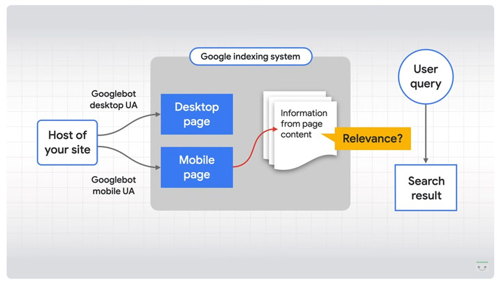
First, Google has fully switched to mobile-first indexing. The final communication from Google about this was on October 31, 2023 when they explained most sites have been successfully moved to mobile-first indexing. That’s important since it means Google will use the mobile version of your pages for indexing purposes. Google is essentially using its Smartphone crawler for indexing purposes. That includes the content, structured data, directives, canonicals, and more. By the way, Google has a great page explaining the most common issues you can come across.
This is why it’s incredibly important to make sure your mobile pages contain what you want indexed. When Google crawls with Googlebot-Smartphone, then you want to make sure everything is present. If not, you could run into some serious problems, whether that’s less content to index, directives that are missing, structured data that’s missing or incomplete, canonicals missing or wrong, and more.
Below, I’ll quickly cover several scenarios where things went wrong for two separate sites. Both are larger sites where this could end up impacting thousands of urls, or more.
Case 1: Playing Hide and Seek With Canonicals (on mobile).
The first site I’ll cover has a footprint of about 100K urls and has been heavily impacted by multiple major algorithm updates over time. While analyzing the site, I noticed that some of my tools were reporting no canonical tags on a number of urls, but when quickly checking in Chrome, canonical tags were in fact there (both in the static and rendered html).
In addition, GSC was reporting thousands of urls categorized as “Duplicate without user-selected canonical”. That was just another sign something was up… When inspecting those urls in Chrome using a mobile user-agent, and checking the rendered html, canonicals were not showing up in the code. In addition, the URL inspection tool was reporting no user-selected canonical.
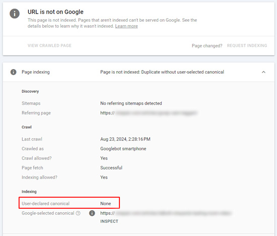
When addressing the issue with my client, it ends up they were only publishing canonical tags for those urls on desktop, and not mobile. And based on what I explained earlier about mobile-first indexing, Google will use the mobile version of the page for indexing purposes. So, thousands of urls had no canonical tags. And on larger-scale and complex sites, you definitely want to make sure you are sending the strongest signals possible about which urls to index, which are the canonical urls, etc. So this was an important find considering the site’s size and complexity.
My client quickly addressed the issue, and the correct canonical tags are now being published across all urls on the site. That’s great, but the issue had been in place a long time. It’s yet another great example of making sure the mobile versions of your urls contain the correct content, structured data, directives, canonical tags, and more.
Case 2: Thin pages becoming *thinner* on mobile.
The second case I’ll cover is a large-scale site with a footprint of over 40M urls. It’s a complex site with many moving parts and has also been negatively affected by major algorithm updates over time. When digging into the audit, I started noticing that word count was lower on a number of pages than what I was seeing while viewing them in Chrome.
So I quickly started checking the urls on mobile devices, and it was easy to see what was going on. The site was publishing less main content on mobile than desktop (and sometimes much less content). Inspecting the urls in GSC and checking the crawl data confirmed this issue across many urls on the site. The worst part was that these were already thinner pages that were becoming even thinner when accessing them across mobile devices. And like I explained earlier, Google will use the mobile versions of the pages for indexing (so Google was indexing less main content than the site owner thought).
Below, you can see the difference in word count for a page crawled with Googlebot-Smartphone versus Desktop (98 words for mobile versus 498 for desktop):


My client is addressing this issue now and the fix could end up yielding much more content across millions of pages on the site. Needless to say, you don’t want your already thin pages getting thinner. That’s not a good thing from a quality standpoint… especially across a large and complex site.
How to check for mobile-first problems (tools and tips):
Again, this is just a PSA to make sure site owners understand that it’s important to ensure all content, structured data, directives, canonicals, etc. are present in the mobile versions of pages. If not, you could be shooting yourself in the foot SEO-wise. Below, I’ll cover some ways to check your pages for problems.
URL Inspection tool in Google Search Console (GSC):
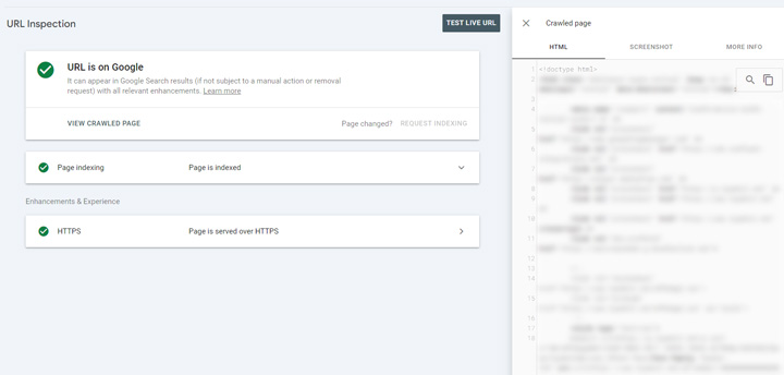
It’s the gold standard, and a great way check specific urls in the GSC UI. Once you inspect a url, you can check the html that Google has indexed, and then also test the live url to check the html for the current version of the page. You can also use the URL Inspection API to bulk check urls for indexing status, which could also surface issues only present on mobile. Note, you cannot see the html code when inspecting via the API. That’s only available via the GSC UI.
Crawling tools like Screaming Frog, Sitebulb, and Lumar with JS rendering on:
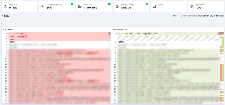
Using various crawling tools, you can view the static and rendered html in bulk and also view rendered screenshots. In addition, you can crawl via mobile and desktop crawlers and then compare crawls. Using crawling tools is scalable as you can crawl an entire site, a large section of the site, etc. It’s worth noting that Lumar just added the ability to save the html and rendered screenshots as well. So all three of those crawling tools can help on this front.
Viewing the static and rendered HTML in Lumar:
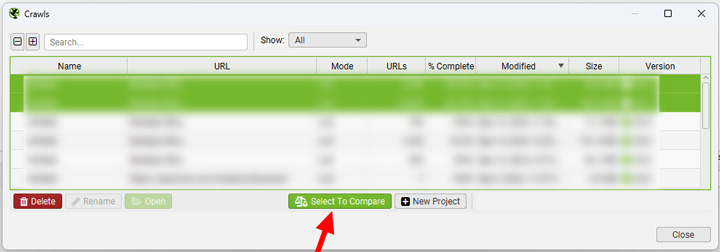
Comparing crawls in Screaming Frog:
SEO Chrome extensions:
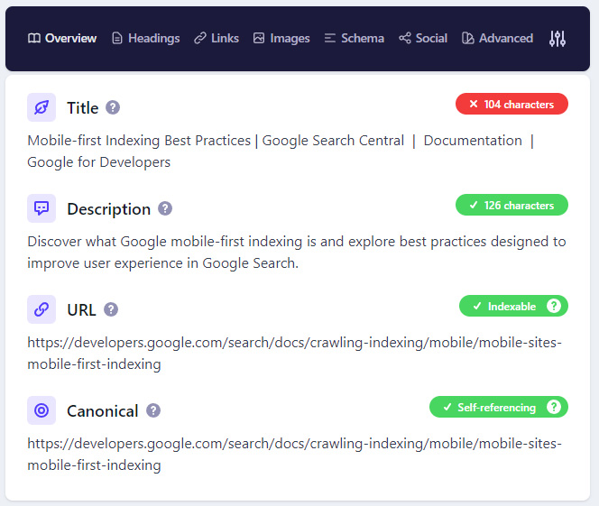
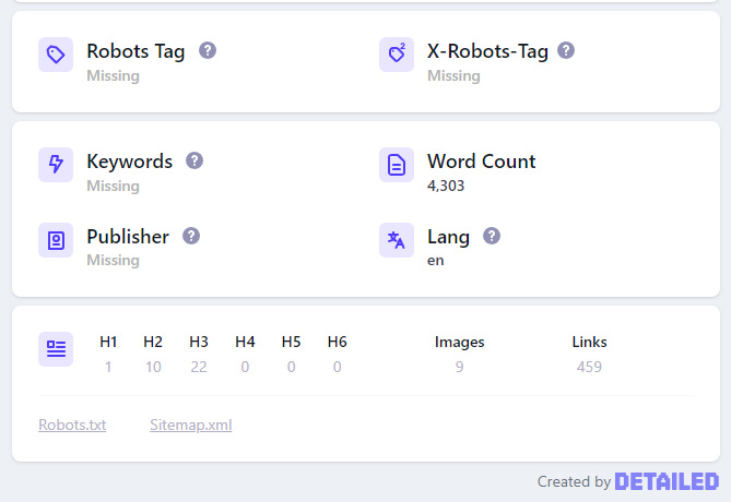
Chrome extensions can provide a quick and easy way to check individual pages (one-off checks). You can sometimes pick up issues by checking what’s showing up in those extensions. For example, the Detailed extension enables you to easily see metadata, canonical tags, word count, headings, structured data, and more. There are several great Chrome extensions and that’s just one I happen to use all the time.
Chrome DevTools:
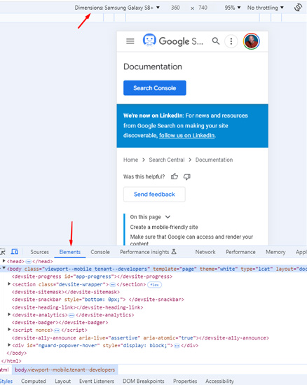
Inspecting a page in Chrome DevTools enables you to see if the content is in the rendered html. And you can switch to emulating a mobile device easily in DevTools to view the differences between mobile and desktop. Then you can compare the rendered html between desktop and mobile. A quick tip, just hit F12 on your keyboard to quickly inspect a url, and then Control-Shift-M to emulate on mobile. Then choose a mobile device from the list.
Site query + quoted text:
And finally, you can perform a quick site query using text from the page in quotes. This will return pages containing that content from a specific site. Google’s John Mueller has explained this technique for a long time as a quick way to check if certain pieces of content have been indexed. Note, this won’t help for checking metadata, directives like noindex, canonical tags, structured data, etc., but can help identify if certain pieces of content are being indexed.

Summary: Don’t miss the mobile view.
It’s important to remember that Google completed the switch to mobile-first indexing in the fall of 2023, and that means it’s only using the mobile version of your pages for indexing. When auditing sites, make sure to view that site through a mobile lens to ensure all the content, structured data, directives, canonicals, and more are there for indexing. If not, you could end up with some strange problems SEO-wise. The good news is that it’s pretty easy to identify the problems once you pay attention to the differences between mobile and desktop. I recommend using the tools I covered in the second part of my post to check your pages (individually and in bulk). Good luck.
GG
